Overview
Role:
Lead Product DesignBusiness goal:
Create an improved Team/Arena focused product that can scale across organizations
Increase team/venue revenueCustomer problem:
Products in market are dated and lack technical innovation
Team apps don’t enhance the in person experienceProcess:
Gathered existing data on fan behaviors & pain points
Empathize/Understand the customer problem
Competitive analysis
Developed user journeys
Determine what success looks like
Design exploration
Stakeholder review & feedback sessions
Generated user flows & prototypes
Design iterations
ExecuteSolution:
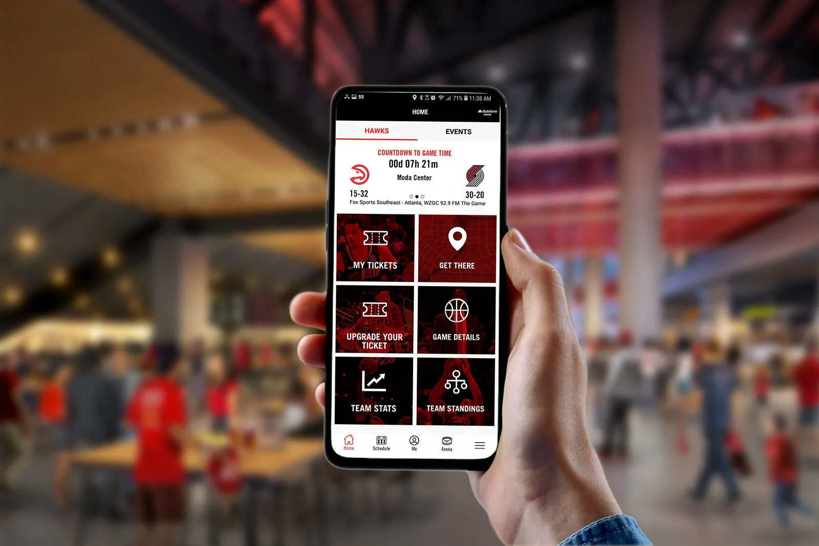
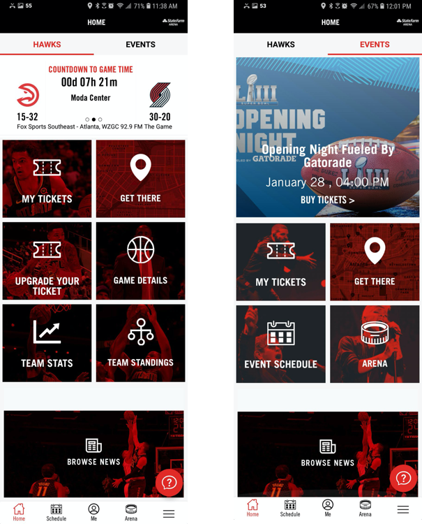
Team & Arena dual experiences
Mobile ticket purchasing
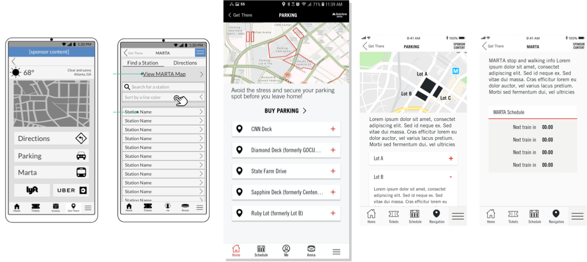
Travel to stadium feature
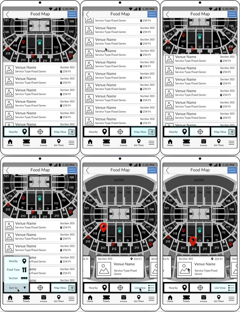
Stadium map
ChatbotImpact:
Success metrics to measure:Generate in-app ticket sales
Increased app installs
Process
Customer research and competitive analysis showed that NBA Team apps were not adequately serving fans or venues. Additionally the Atlanta Hawks Basketball Organization wanted to leverage its mobile experience to increase revenue.
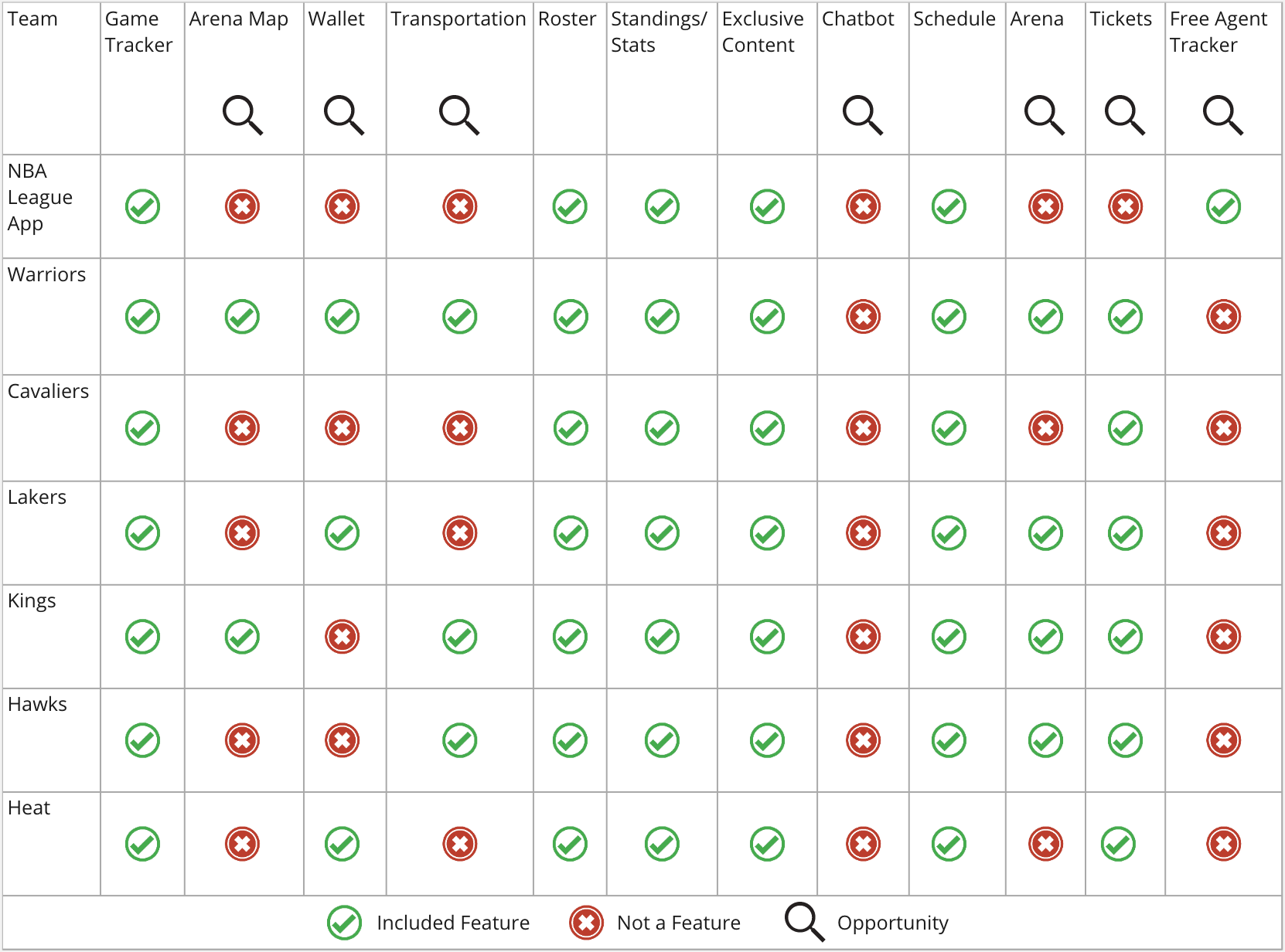
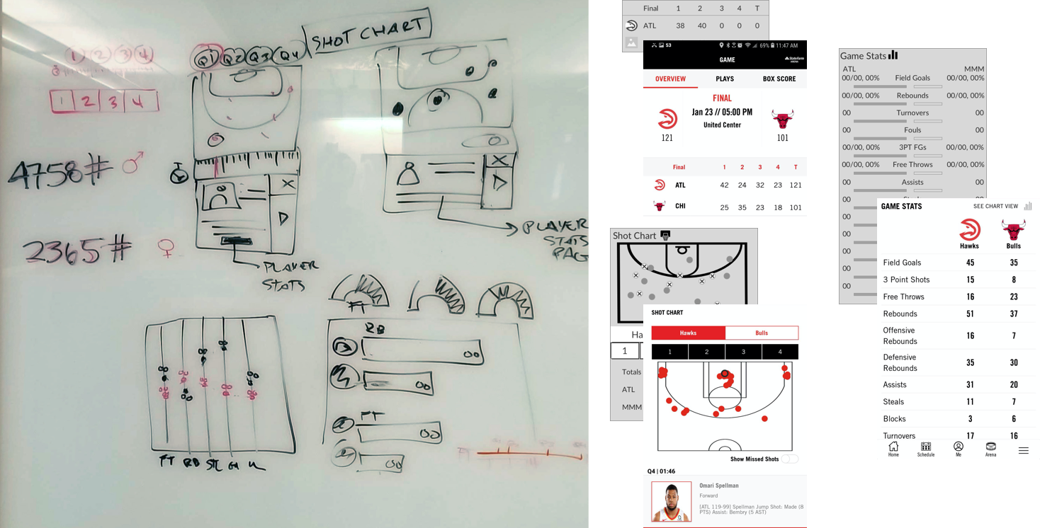
Fans were expecting more than simply a portal to team stats and scores. They were craving an immersive experience that would satisfy both fans watching from their couches as well as the entire journey of ticket-to-game. I conducted a competitive analysis to better understand the current offerings in market, and to highlight opportunities to innovate and differentiate our mobile app from the existing competition. Among these new features were a dual team/arena experience, team statistic innovations, ticket purchasing, travel to game information and the introduction of a chatbot.
Competitive analysis of NBA team & arena apps
This analysis influenced the opportunity for innovation and feature differentiators.
I explored a series of user journeys. These journeys included a Score checker-to-arena journey and a refreshment break journey. Leveraging the user journeys I established user flows and wireframes. While an ongoing discussion between all stakeholders allowed for efficient iteration and refinement of feature scope and technical limitations. Early on, research revealed that innovating user stats was a non-issue which allowed the team to pivot; shifting resources to efforts that would more effectively move the needle.
Score Checker-to-Arena Journey
Solution
In order to increase revenue, putting people in seats was the lowest hanging fruit. I made sure that a prominent ticket purchasing feature was accessible during the entire experience. The dual team/arena experience offered the additional value of getting non-NBA fans to the arena for live concerts and speaker tours. With the newly added Get there feature Hawks fans and concert-goers alike could navigate to their destination seamlessly using public transportation, or easily access official parking on all within the app. And last but not least, the integration of the chatbot would usher in a new era of fandom utilizing state of the art technology to curate custom experiences.
Impact
The Helios work was officially complete after the initial design work was delivered to engineering. I worked with my internal product owner and stakeholders from Raw Engineering and the Atlanta Hawks organization develop a roadmap for research and testing that would allow for continued feature iteration based on our explorations. My recommendation of initial success metrics were the following:
Increased ticket sale via the app
Increased app installs
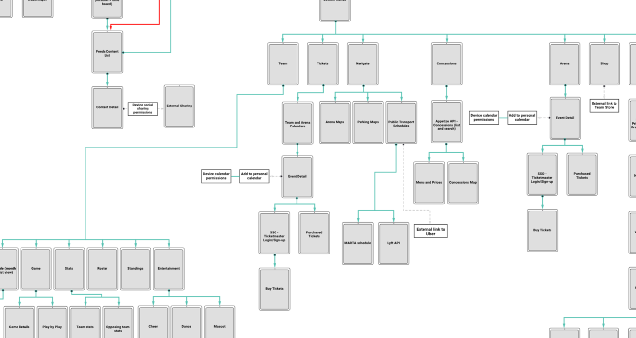
Establishing User Flows & Site Map
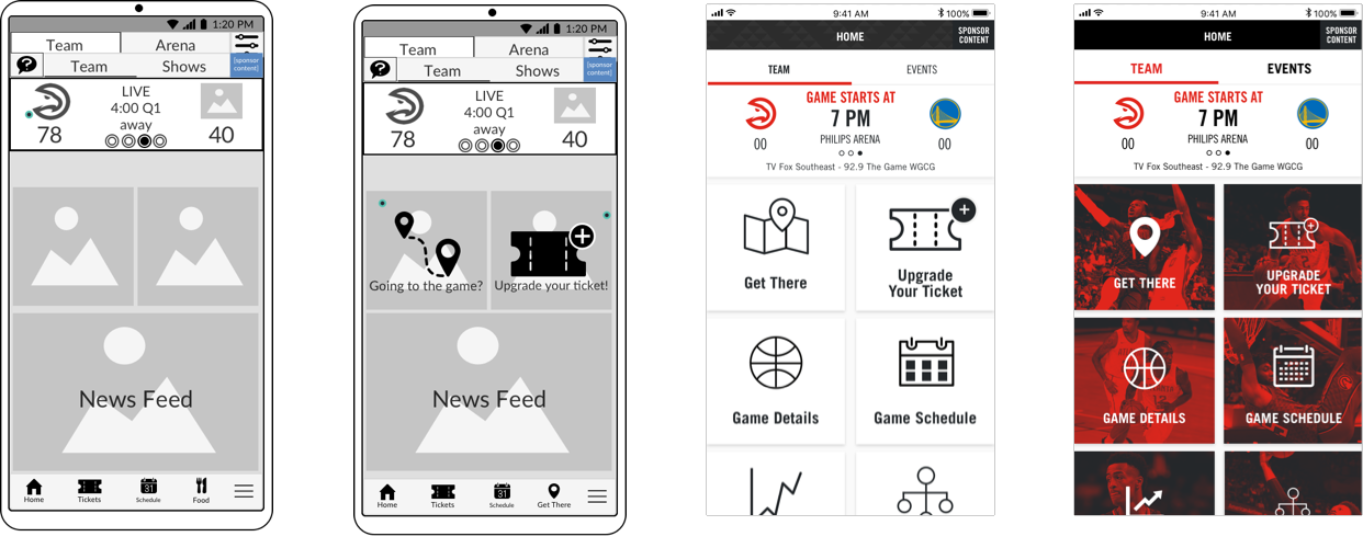
Iterative Design & Cross-Functional Collaboration
Working with my visual designer, the RAW engineers and the Atlanta Hawks' brand team we worked iteratively to craft the best UI while maintaining fidelity with team and arena branding.
Chatbot - Research & Iteration
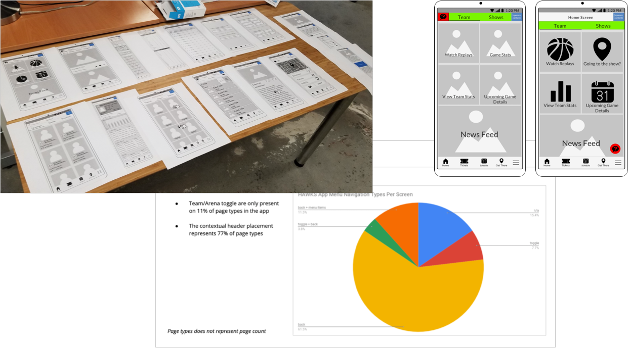
The Hawks made a strong push for the Chatbot icon to live in the header, alongside the team/arena toggle. When I explored this in wireframes, it just wasn’t working. I decided to take a look at the app from a different elevation. I placed printouts of our screens side by side, and immediately saw that the the Team/Arena header only appeared on 11% of screens, making it a poor choice for persistent placement of the Chatbot icon. I explored alternative placements to make the case for moving it out of the header. The Hawks were a hard sell but agreed that the Chatbot icon needed relocation. They accepted my recommendation to use the floating action button (FAB).

